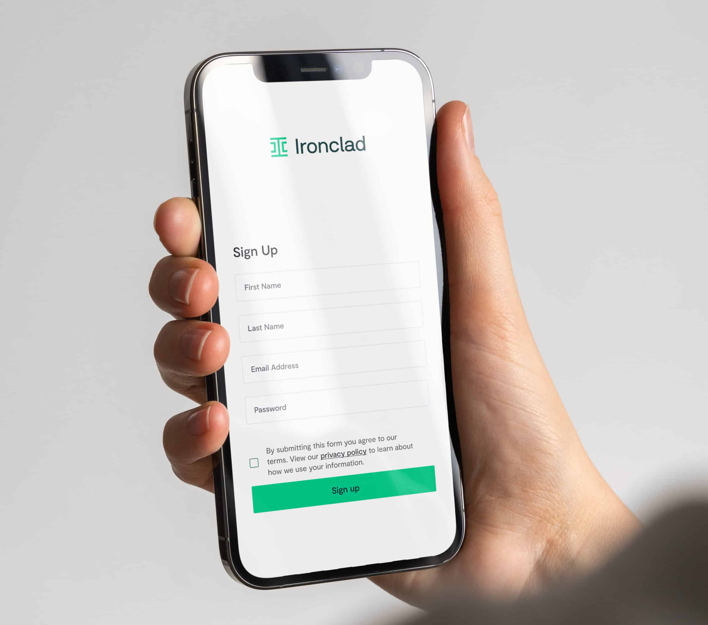
Ironclad Clickwrap
Contracts in a Click
The fastest, easiest way to gather a legally binding digital acceptance, click-to-accept agreements help forward-thinking companies manage high-volume, non-negotiated contracts like terms & conditions, NDAs, and liability waivers. And the best way to manage them? Ironclad Clickwrap.
Limit risk while providing a seamless experience? Win.
Request Demo
Watch Product Video
Powering over 1 billion contracts for the world's biggest brands


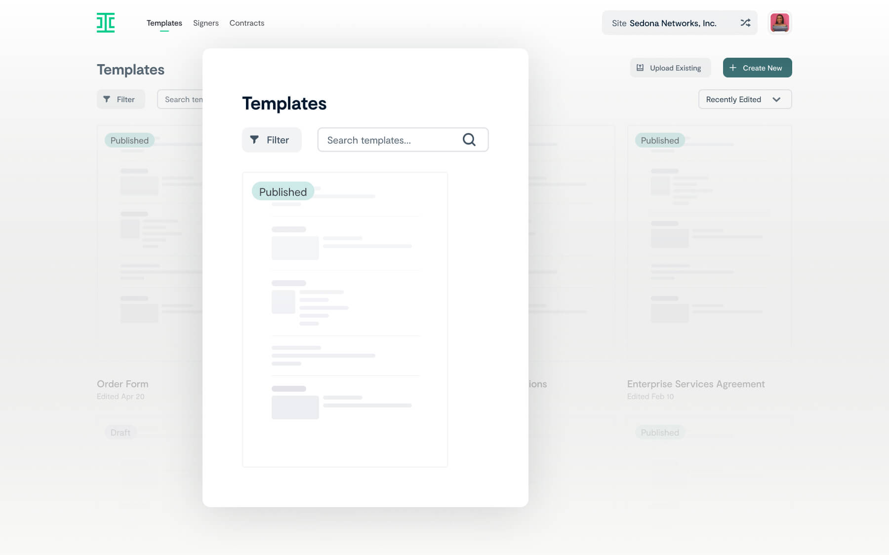
Speed up contract creation time
Ironclad Clickwrap’s user interface was designed for faster, easier contract creation, offering:
- Easy-to-follow, personalized blueprints for implementation
- Simplified version management without the need for dev resources
- Contract template uploading and editing functionality
"With Ironclad Clickwrap, our NDA signature turnaround time was cut down from 26 days to just 2 minutes."

Daniel Michalek
Legal Operations Manager
Branch
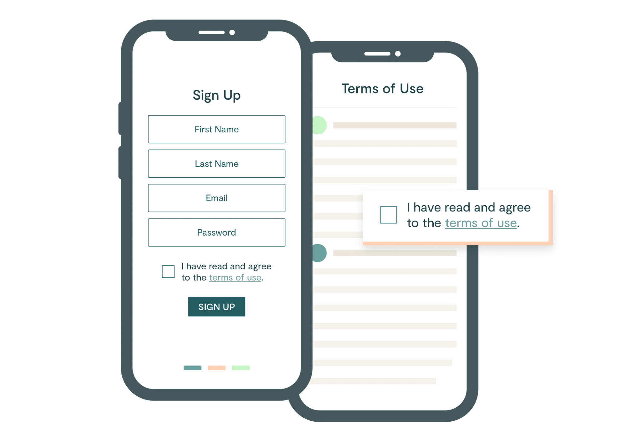
Get to acceptance faster
Purpose-built to make one-click acceptance seamless on any device, Ironclad Clickwrap will:
- Eliminate back and forth on low risk or non-negotiated contracts
- Ensure that the right agreements are presented at the right time
"Time to acceptance is down a ton, so our reps are happy. And our legal team is saving dozens of hours a month not having to field questions or do anything with these lower value agreements—they can focus on the more important deals."

Sheena Ferrari
Head of Global Legal Operations
Snap Inc.
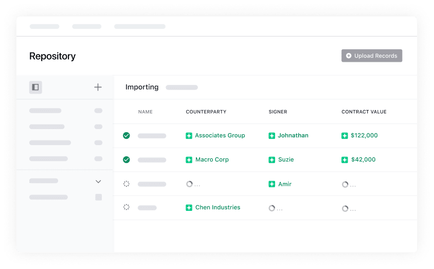
Mitigate risk with the power of Ironclad Clickwrap
Clickwrap agreements tend to have a high enforceability rate given that they require users to agree to the terms. Ironclad Clickwrap doubles down on protection, providing:
- Snapshots, a feature that automatically captures visual evidence from wherever the agreement lives
- Easy contract tagging, storage, and metadata search functionality


Stephen Chu
Chief Legal and People Officer
InStride
Ironclad's Clickwrap enabled us to intake and organize a large volume of contracts. Without Ironclad, we would have spent considerable time and resources to attempt to build a solution of our own.
Read the customer story